by Bev Harcus and Pat Jaster
PRIMARY COLORS
When you work with color, two of the most important things to learn are:
- How to mix colors to that you can get exactly what you want;
- How to control color values so that your pictures don’t look too flat.
Primary means “first”, and primary colors are therefore the first colors you need in order to mix a variety of other colors. Knowing your primary colors is the first step to achieving proper color mixing.
What are primary colors?
Color is actually a component of light. Light travels in waves, and these waves have different lengths and speeds. When the waves reach our visual receptors (our eyes), we experience the sensation of color. These wavelengths of light can be broken down into three (primary) categories:
- The longer, slower wavelengths produce red light
- The shorter, quicker wavelengths produce blue light
- The middle range wavelengths produce green light.
- An equal mixture of these wavelengths produces pure, white light.
Red, green and blue are called the primary colors of light. These colors are used to project images in television screens, computer monitors, and anything that transmits light from a light source.
But, as artists, we are using pigments (paints, inks, dyes, etc.), not light. So what does light have to do with primary colors? Actually, everything! Colors of pigment are produced by reflecting and absorbing certain wavelengths of light.
Primary colors of pigment
A primary color of pigment is a color that reflects equal parts of any two of the (primary) colors of light (red, green and blue). Diagram A illustrates the result of projecting red, green and blue lights onto a white surface in overlapping fashion. Where any one light reaches the surface, it is reflected back from the surface. Where two lights overlap, they are both reflected from the surface, resulting in a mixture of those two colors. Here’s how it works:
- Where red and blue lights overlap, they combine to produce magenta.
- Where blue and green lights overlap, they combine to produce cyan.
- Where green and red lights overlap, they combine to produce yellow.
- (Where all three lights overlap, they combine to produce white.)
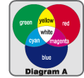 (See Diagram A) These three resulting colors, cyan, magenta and yellow, are the three primary colors of pigment. These are the purest colors, and cannot be produced by mixing other pigment colors.
Using these three colors, you can produce a vast number of other colors. When white or black are added to your colors, the range is even greater. Following is a very basic guide for mixing colors using cyan, magenta and yellow.
Mixing Colors
First, let’s take a look at what happens when we overlap the three primary colors of pigment. Using a format similar to a Diagram A, we can mix “equal” parts of any two of these primary colors to produce an opposite result. Diagram B illustrates the results of blending (mixing) equal parts of any two primary colors of pigment. Because pigments reflect and absorb light, their resulting mixtures are not as pure as light. Some pigments tend to be more intense than others, so an “equal” mixture is relative to the intensity of the pigment. This is why a color wheel is very useful as a guide to color matching.
- When magenta and cyan pigments are blended, the resulting mixture is blue.
- When cyan and yellow pigments are blended, the resulting mixture is green.
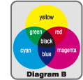
- When yellow and magenta pigments are blended, the resulting mixture is red.
- When all three colors are blended, the result is a “black” color. This black is rarely a pure black, as some light is still being reflected.
Okay, so now we have our three primary colors. How can we produce so many other colors from just these three? Actually color is quite mathematical. Just as you can add 1 and 1 to make 2, or 0.5 and 0.5 to make 1, you can mix colors in a similar manner.
Let’s start with yellow and magenta. If you mix these two colors together, you produce red. What would happen if you then mix yellow and red? Here you have twice as much yellow as magenta, and the resulting color is orange.
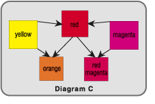 Diagram C shows how colors can be incrementally mixed to produce a vast array of “in-between colors”.
But what if you want to produce a beautiful, rich brown, a maroon, or a subtle grayish-blue? This is where placing colors around a wheel is an excellent way to illustrate color mixtures. The colors we have looked at so far are produced in a “linear” fashion, by mixing any two colors equally, then varying the amount of each of the two primary colors.
If we look at colors arranged in a circle, we will see that colors can also be mixed across the circle. So far, we have mixed only around the outside of the circle.
Creating Tones
“Breaking colors” across the wheel, or creating tones, is achieved by mixed varying amounts of colors that are opposite each other on the color wheel. For instance, if you mix equal parts of red and cyan (opposite colors, or complements), the result will be a dark grayish-black color. (Opposite colors neutralize each other). If you mix a small part of cyan to red, the result will be a red-brown color. If you mix more cyan, the result will be a bit grayer, etc. When creating tones you are actually lowering the saturation, or intensity, of the original pure colors.
Creating Tints
When you add white to a color, you are creating a tint of that color. The more white you add, the lighter the color becomes.
Creating Shades
When you add black to a color, you are creating a shade of that color. The more black you add, the deeper the color becomes.
Start Mixing
Now you have the basics of mixing colors from the three primary colors, cyan, magenta and yellow. If you have a color wheel it will be easier to practice mixing, as you can look at the wheel and have an actual color to match. Practice mixing colors around the wheel, and when you are happy with the results, try mixing across the wheel, then creating tints and shades by adding white or black to any of your colors. Happy painting!
Bev Harcus is an artist and instructor in computer graphics, and color theory. Bev and Patricia Jaster, owners of Artscool Graphics, work closely with The Color Wheel Company. Bev and Patricia are available for workshops on color theory and color mixing. They can be reached at info@colorwheelco.com.